Sunday, October 28, 2012
Tuesday, October 23, 2012
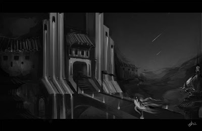
Revisiting a familiar place
For warm up today, I am revisiting an old piece from when I was in Jason Scheier's class earlier this year.
Saturday, October 13, 2012
The bathroom, it talks to me.
The wall pattern and the initial thumbnail.
WIP: experimenting with some colors.
Forgot to post this one.
So, we rented a nice house in AZ now that we have relocated, settling in and such. One day in the guest bathroom, I notice the paint are like small blocks of paint. Rather than flat wall, it is got these paint textures on it. So naturally I look around also, because this part of Tucson have scorpions. I've already found one the 3rd day I moved in, so I'm extra paranoid now days, I look everywhere, wall, floor, ceiling...
However on this one part of the wall, I saw this pattern in the paint job, back in TX, I used to do this with the marbling of the floor tiles, or the stubs on the ceiling. So... I took a picture of it with my phone and this is what I came up with.
Values! Important no matter what subject matter it is...
More Albert Bierstadt studies
So, back late September during Industry Giants after party, I got to talk to some wonderful talented artists as well as industry guests. Totally prepared, I shared my portfolio with them and received some very encouraging feedback.
One of the guests for the event was Jason Felix, I've only seen some of his works online prior to attending the event, and during his presentation, I was pretty hooked on his works (as well as his stage presence, it's not everyday where the concept designer actually dress in a complete ensemble. From accessories to shoes, to the delicate textile prints and facial hair trim, it was totally a character standing on the stage. It's SO nice!)
Anyhow, when he was browsing through my portfolio and stopped on the previously done Bierstadt studies, he asked me if I color picked the colors. Well, for the previous 6 studies, I originally tried to come up with some kind of pallet, like a limit of 5-6 colors and try to figure out how to get the desired look. I have totally over looked value! The sad part was... I knew the importance of value and how the first step of composition is to make sure the value is well balanced. Before, after I did the color, I would turn on the b/w filter to check value likeness.
So now, I am doing it differently, I'm turning b/w on first, and look at the original image with the filter and without the filter for a while, just to look at the relationships. I remember in the class with Jason Scheier, he would talk about Nōta, he would often show us the light to dark/dark to light transitions using examples like Dylan Cole and his own works. I know what I'm looking for now during these studies, this is a LOT harder than my initial approach.
Subscribe to:
Comments (Atom)


